Restyling in mijn woonkamer met de trendkleur groen

Een tijdje geleden deelde ik op mijn instagram een moodboard waarbij ik vertelde dat ik een restyling zou gaan doen in mijn woonkamer met de kleur groen. In deze blog vertel ik meer over hoe ik tot deze keuze ben gekomen.
[ English below ]
De trendkleur groen
Groen is een trend, al een langere tijd. Zowel in het gebruik van planten als verschillende tinten groen in het interieur. Mijn huis is een plek waar ik graag met kleur werk en waar mijn huis in het begin nog helemaal wit was, zowel de wanden als de vloeren, krijgen nu verschillende wanden in mijn huis een kleur. Ik liep al een tijdje met het idee dat ik een wand in mijn huis groen wilde gaan verven, maar welke wand? Hoe ik tot die keuze ben gekomen vertel ik in de eerste styling video die ik heb gemaakt voor deze restyling. Ik ben erg benieuwd wat je hiervan vindt!
Green is a trend for a while now and I love it. It’s a trend for the use of green in our homes but also different shades of green in your interior. My home is a place where I love to work with colour. In the beginning my home was completely white, the walls and floor as well. But from time to time I start to paint my walls in different colours and I like it how my home is changing. For some weeks I have thought about the use of the colour green in my home, but what wall? How I choose the wall I will tell in the first styling video I have made about this restyling. I am very curious what you think about this.
Het kiezen van de juiste materialen
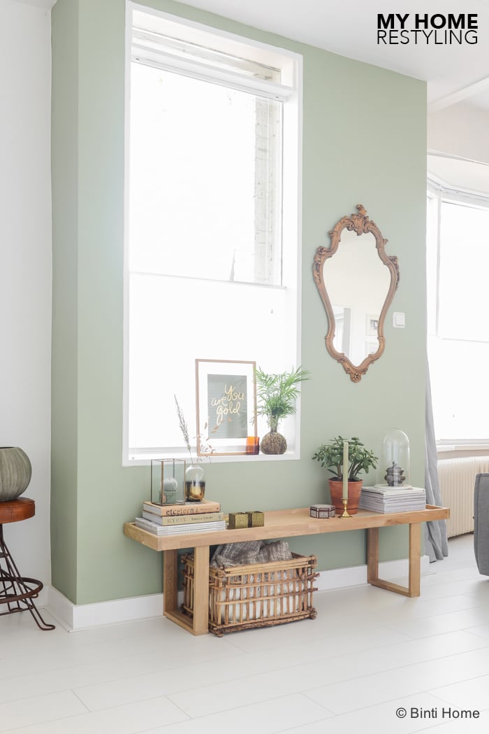
Ik vind het erg fijn om met natuurlijke materialen te werken en dat dit vooral goed aansluit bij de kleur. Ik werk niet met harde contrasten maar wel met gelaagdheid. Het verschil is dat ik bij harde contrasten denk aan kleurencombinaties die niet zo voor de hand liggend zijn en wat hard zijn. Bij gelaagdheid kies ik voor verschillende materialen maar met eenzelfde kleurtoon en in dit geval allemaal een natuurlijke vergrijsde uitstraling. Wat vooral belangrijk is bij het creëren van een balans is dat materialen of kleuren op meerdere plekken terug komt. Op deze manier ontstaat er een eenheid en balans.
I really enjoy working with natural materials and especially when I can match this with the right colours. I do not work with hard contrasts but with layers. The difference is that I believe when you work with strong contrasts of color combinations can make a room hard. With layering different materials and colours of the same tone it will give a space a natural look. If you want to create a balance it’s good to put the colours and materials in several places in a styling or room. How I did this? You can read below.
Concreet voorbeeld in de styling van deze groene wand :
De materialen waarvoor ik heb gekozen bestaan met name uit eiken hout, brass (goud), glas en papier. De tafel/kast is van eiken hout en de foto frame ook, de mand onder de kast is van bamboe maar heeft wel eenzelfde uitstraling, hetzelfde als de boeken van styliste Sibella Court. De kleur of materiaal brass ( goud ) is duidelijk te zien in de spiegel welke ik mee nam uit België, de kandelaren, waxinelichthouders en displaybox. Omdat ik terracotta erg mooi vind bij groen heb ik dit ook bij deze setting geplaatst maar alleen één pot zorgt voor teveel contrast. Daarom heb ik subtiel een waxinelichthouder in dezelfde kleur naast het frame geplaatst zodat het weer in balans is. Het groen van de planten zorgt voor een levendige uitstraling. Zoals in de video ook te zien is ben ik bij de styling van een ruimte bezig met het verschuiven van de producten. Ik blijf de producten verplaatsen totdat ik het gevoel heb dat het ‘plaatje’ klopt. Styling is dan ook een gevoel en voor iedereen persoonlijk.
For this restyling I have chosen for the materials oak, brass (gold), glass and paper. The table / cabinet is made of oak and the frame as well, the basket below the cabinet is made of bamboo but it has the same look, as well as the books from Sibella Court. The color or material brass (gold) is clearly seen in the mirror, what I took from Belgium, the candlesticks, tea light holders and the displaybox. Because I love the material and look of terracotta I have put a pot on the table/cabinet. But If I only put one there will be too much contrast. Therefore I put a small tea light holder in the same colour as well next to the frame to keep some balance. The plants will give the setting a lively look. As you can see in my stylingvideo, I moved the products around many times when I am doing a styling. I continue to move the products until I have the feeling I created the ‘right picture’. Styling is a personal sense. Below you can find the brands and stores I got the products from.
Het shoppen van de producten
De producten die ik heb gebruikt in deze setting in mijn woonkamer komen van verschillende plekken vandaan.
– Wand Flexa : J0.10.60
– Tafel / kast : Basiclabel
– Plaids : Hema
– Spiegel : Brocantemarkt Brussel
– Frame : A3 Moebe
– Print ‘You are gold’ van ILoveMyType
– Vaas met goud en waxinelichthouders vierkant brass: H&M
– Display brass : House Doctor via Binti Home
– Boeken : Sibella Court
– Basket / mand van bamboe : originele fruitmand uit Egypte
– Vloer : Praire van Ikea
– Terracotta pot Ikea
Ik ben erg benieuwd wat je van de styling van dit wandje vindt! Benieuwd naar hoe het er eerst uit zag en hoe ik tot deze styling ben gekomen? Bekijk dan de stylingvideo op mijn youtubepagina! Fijne zondag.
I am very curious what you think of the styling of this wall. Would you like to know how this corner looked before the restyling? You can take a look on my youtubepage to see my first stylingvideo about this metamorfose. Wish you a beautiful sunday!


Styling en fotografie : Souraya Hassan, Binti Home